Ace Hotel
Brand-first web experience that books
WHAT WE DID:
Strategy • UX/UI Design • Design System • Component Library • Front-end Support
SECTOR:
Hospitality
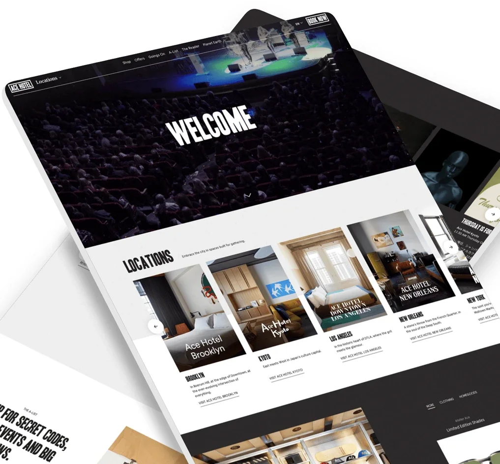
Ace Hotel is a culturally driven hotel brand with properties worldwide. The brief: keep the distinctive Ace Hotel vibe while making the site faster to understand and easier to book.
The Problem
The previous site looked on-brand but made completing a booking harder than it should be. Navigation and key actions needed to be clearer.
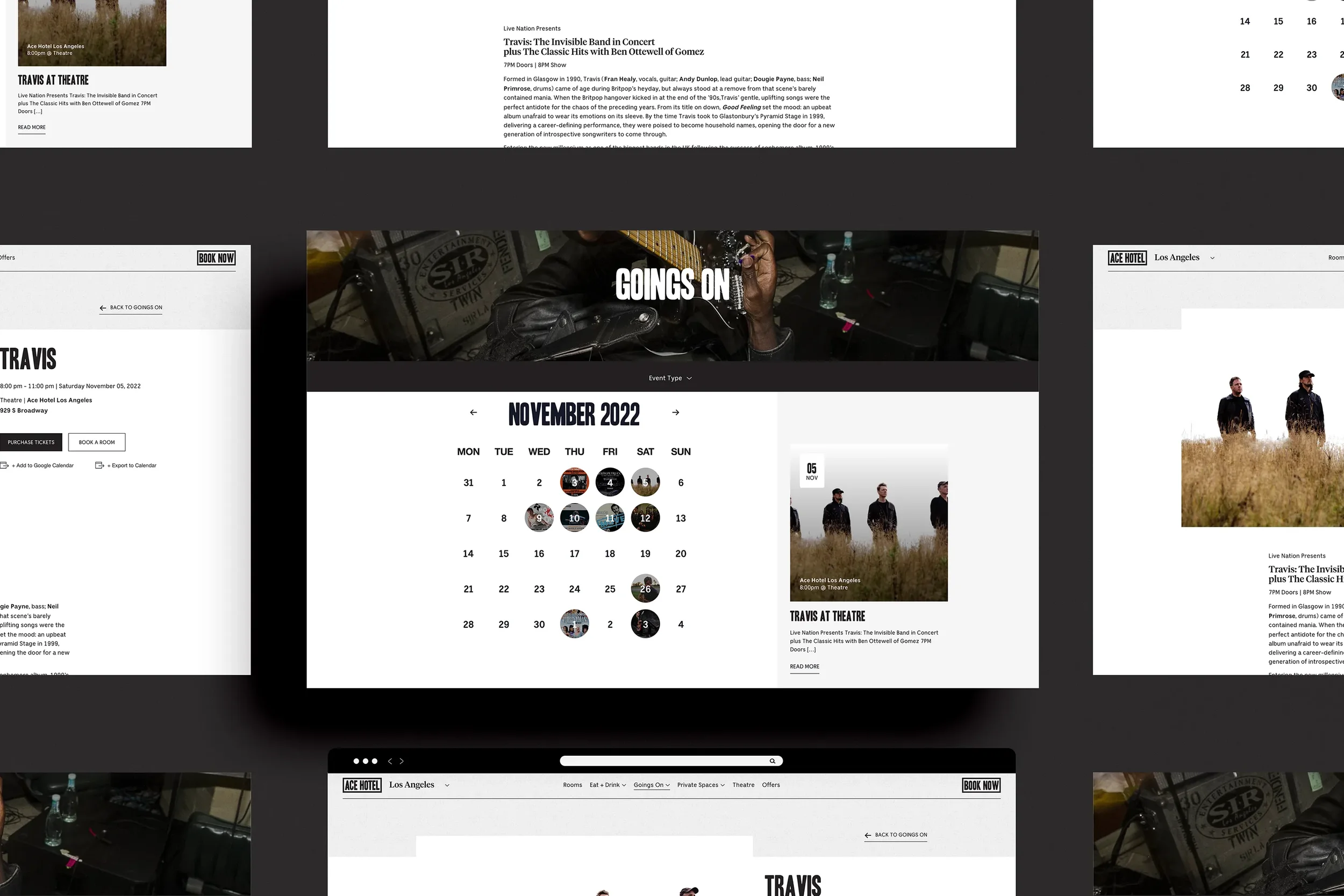
The events experience needed to match how central on-property happenings are to ACE’s identity.
The platform had to scale as new locations came online and still let each property express its own character.
Our Approach
Start with audiences and outcomes, then design paths that serve each one.
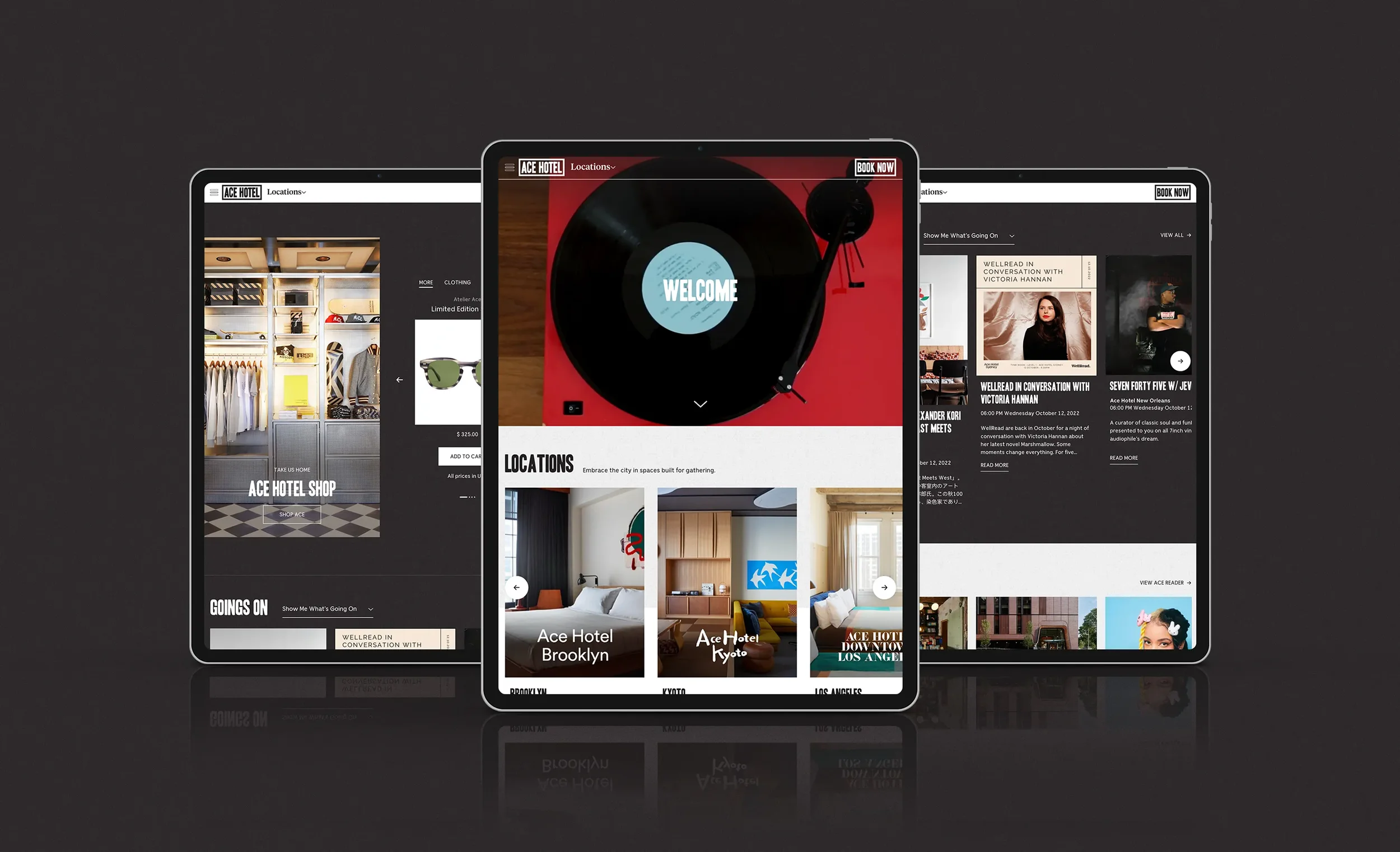
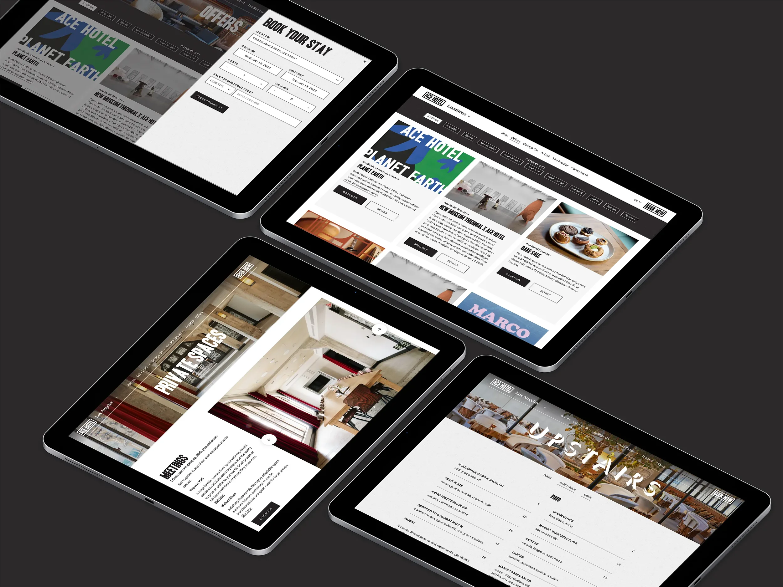
Booking front and center. A persistent, simplified nav with a prominent booking action improves findability and follow-through.
Wayfinding and discovery. Clear routes to explore all locations so loyal guests can find new destinations quickly.
Modular system. Reusable templates and components make it easy to add properties and keep brand cohesion.
Events, elevated. A tighter events flow so guests can discover and act on what’s happening on property.
(Delivered in partnership with Wallop’s hospitality team.)
What We Made
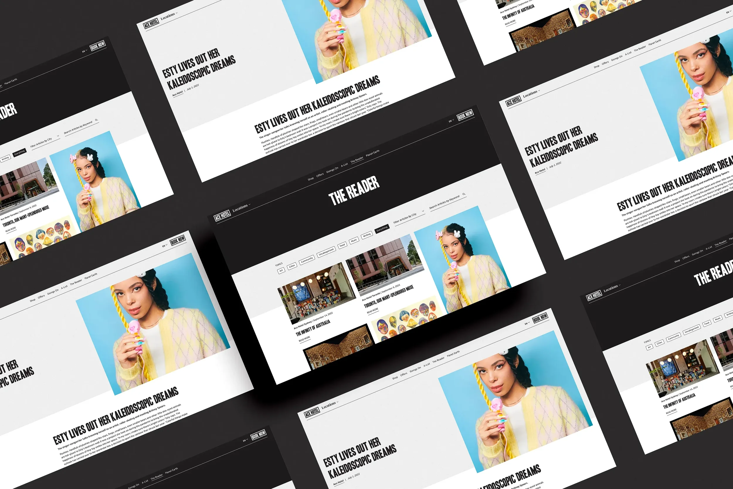
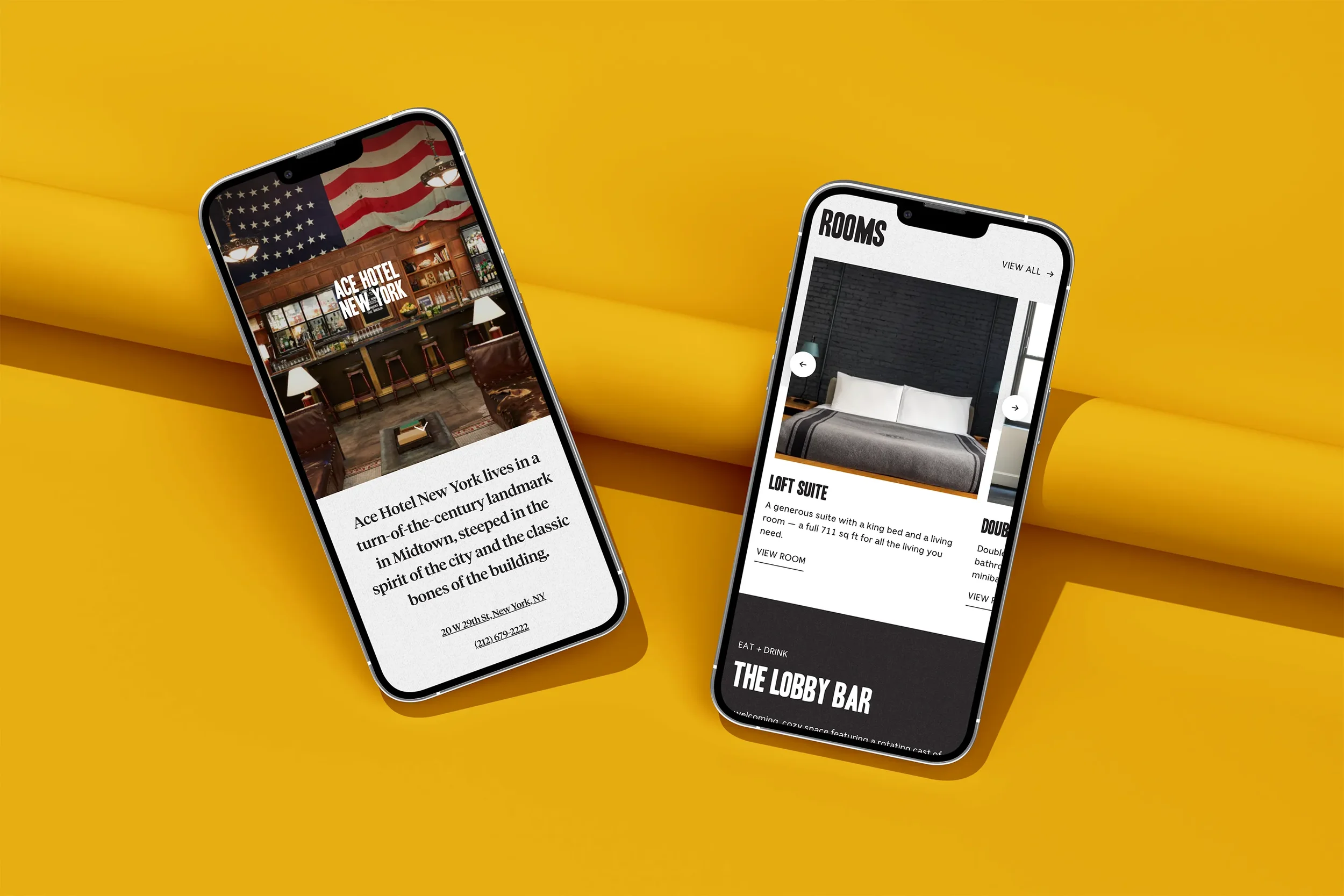
Corporate and property templates for Home, Property, Rooms, Offers, Events, and Journal.
Booking-path UI that keeps dates and availability close to content.
Component library for cards, galleries, menus, FAQs, promos, and CTAs.
Content and analytics basics so teams can update confidently and measure what matters.
Outcomes
Within two months of launch (September 2021):
+59.45% website transactions
+55.11% website revenue
+50% e-commerce conversion rate
All while keeping Ace’s brand personality intact.
Project Facts
Client: Ace Hotel
Role: Strategy, UI/UX, design system, component library, front-end support
Partners: Wallop (web development, digital marketing)
Platforms: Corporate + multi-property web
Related Work We Have Done
White Lodging →
Recruitment-first corporate site and scalable property platform.
FieldStation →
UX/UI for an outdoor-first hotel brand.
Oakmont Senior Living →
UX/UI that makes tours and careers easier.

