Canada Soccer Concept
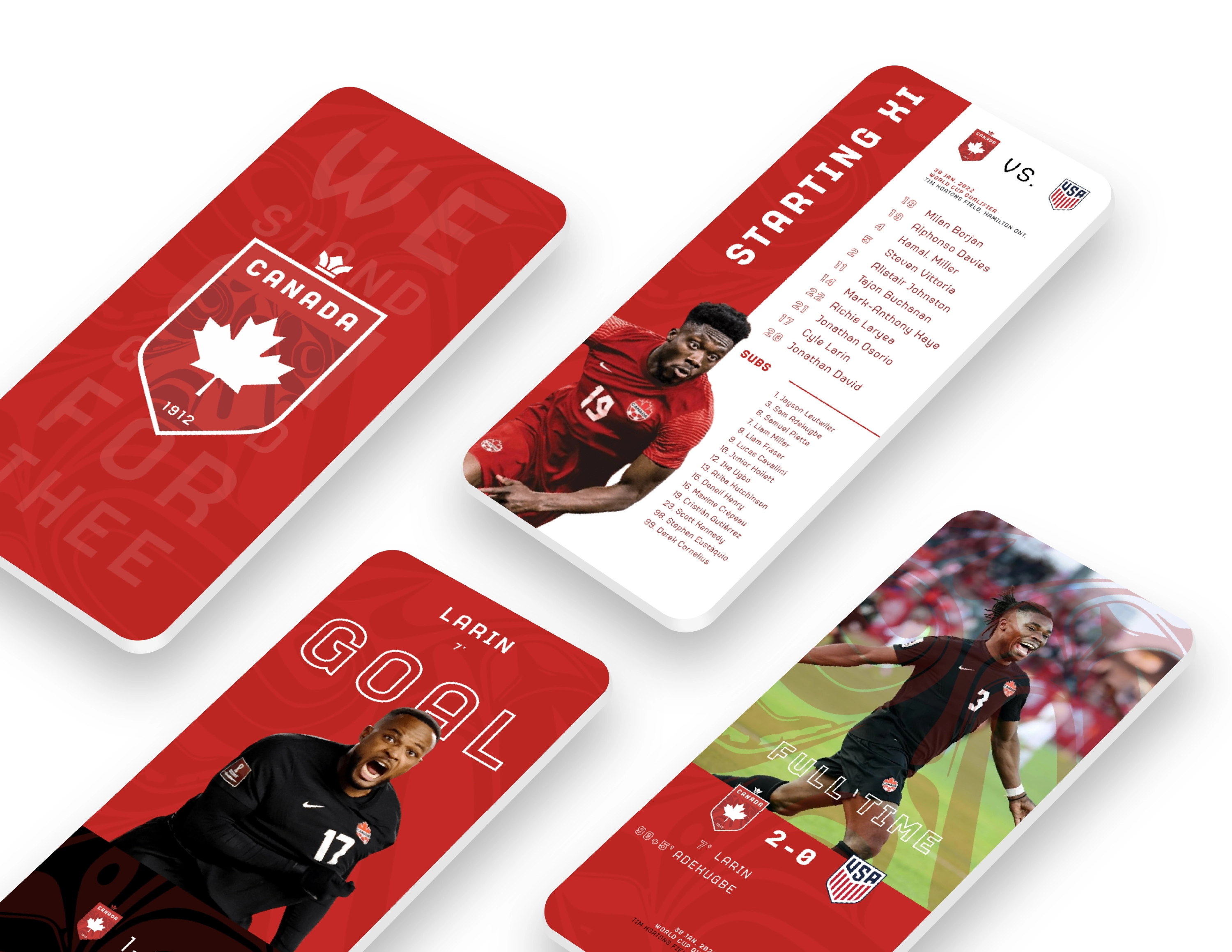
Canada’s monumental achievement at the 2022 World Cup in Qatar has made this nation swell with pride. The women’s team have been consistently performing at the highest level, and for the first time since 1986 the men’s team made it to the tournament. Never before has Canadian talent had exposure of this magnitude. In 2026, Canada will once again be on the international stage as a host nation. This is an ideal time to re-evaluate the brand and bring it more in line with what the country stands for today. On the world stage Soccer Canada’s brand doesn’t match up to these achievements or the brand marks of other countries. This proposal shows a possible direction that Canada could move towards.
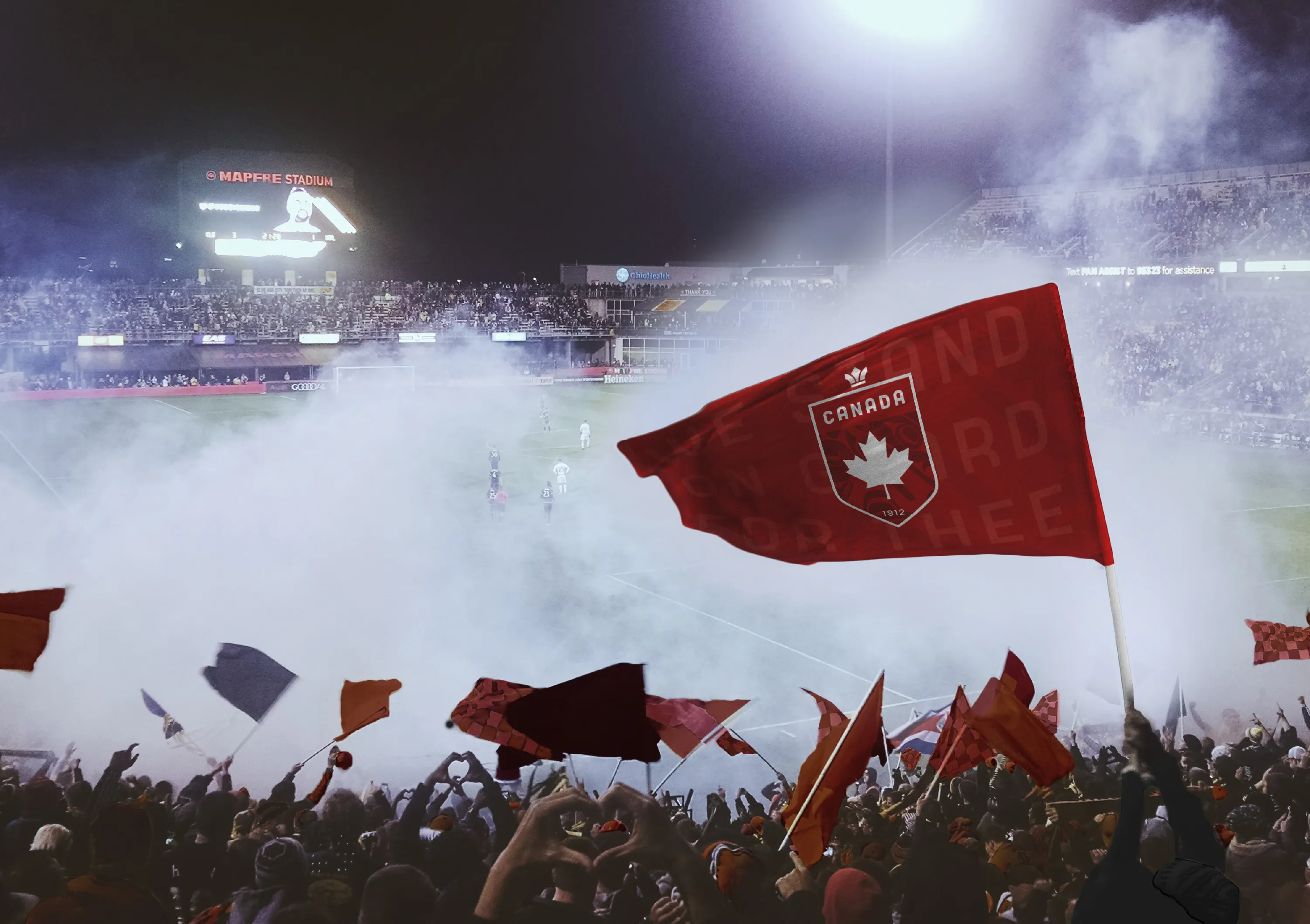
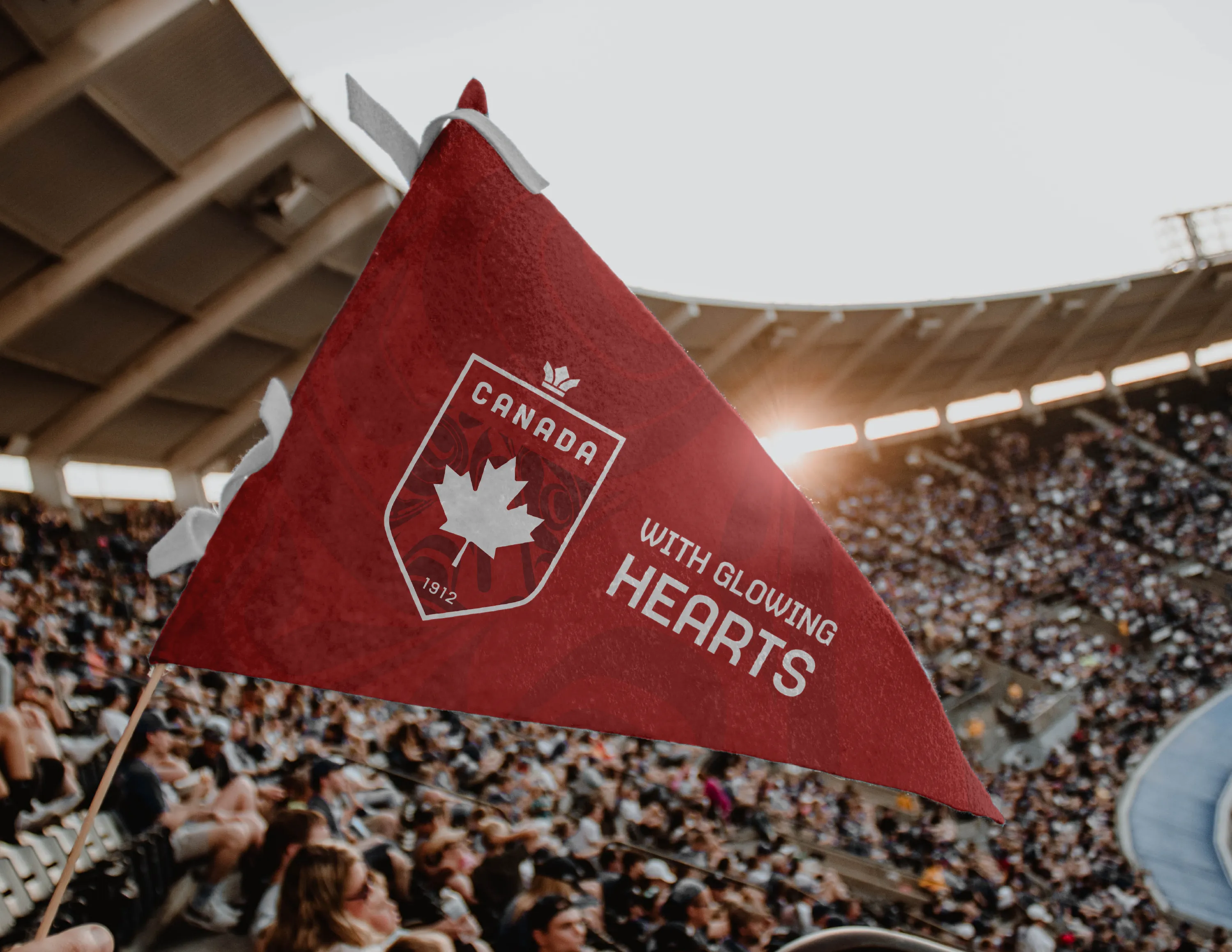
The elements in the logo include:
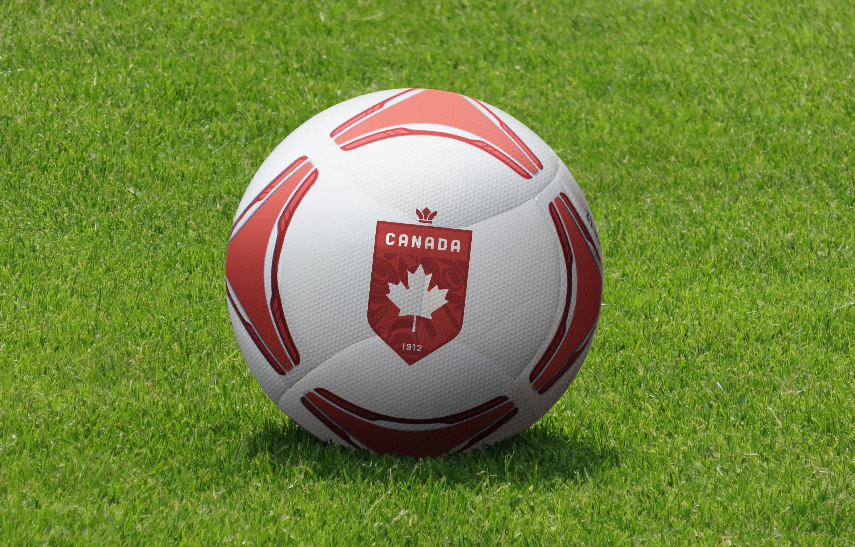
The Maple Leaf: Our national symbol/flag.
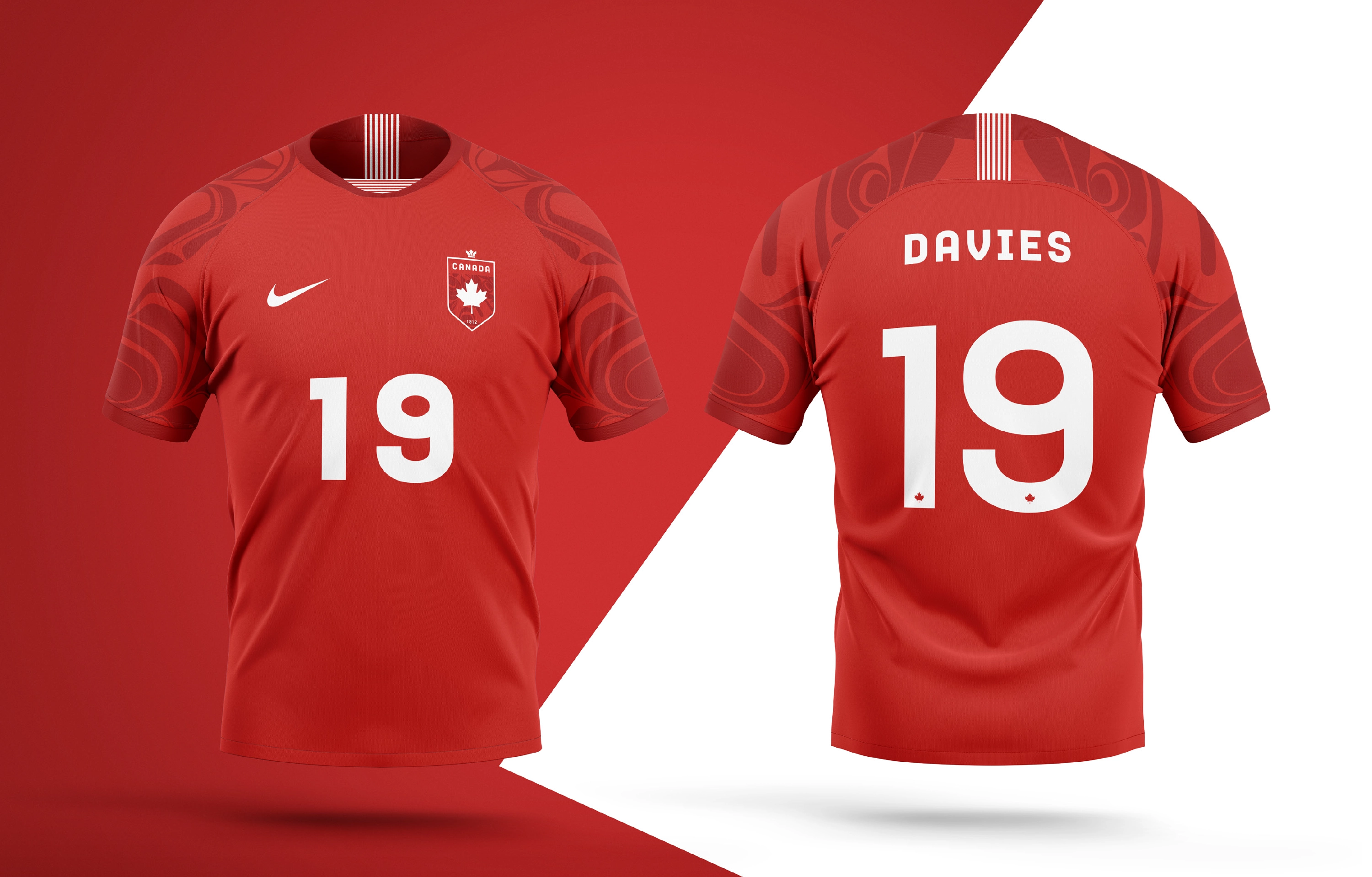
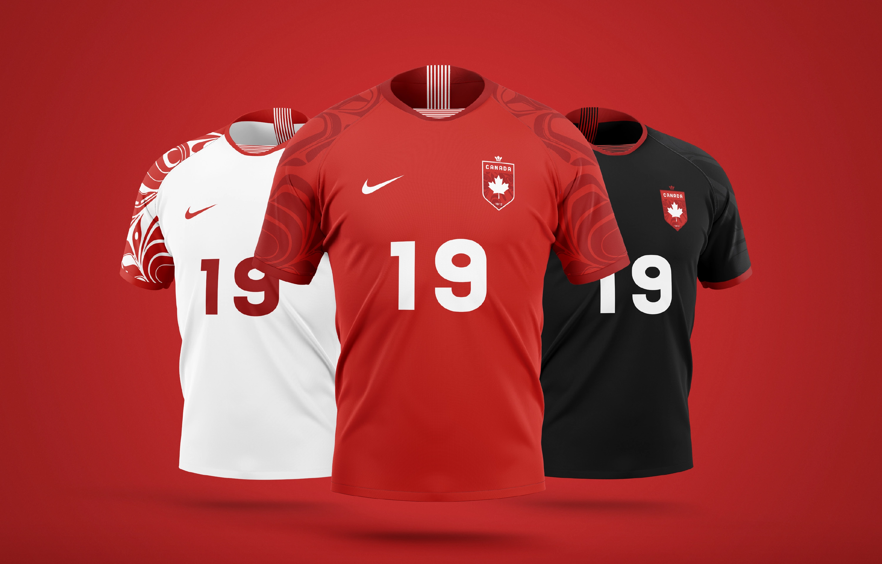
Indigenous Art: Canada is a place where everyone belongs. A place where we are proud of your heritage. The country has taken important steps with the Truth and Reconciliation Commission, and we believe it is important to honour the Indigenous population. The logo features a graphic inspired by Coast Salish Artist Joe Wilson’s Orca print.
Crown/Fleur de Lis: A crown motif which takes visual cues from the Fleur De Lis for it’s upper parts. A symbolism of Canada’s bilingualism.
Year of Establishment: Recognising the long history Canada has with soccer.
Typography has also been carefully selected based on two factors; 1. the type must have been created by a Canadian Type Foundry and 2. should mirror Canada’s personality. Aqueo by Vancouver based R9 Type+Design has been chosen for it’s hard straight lines illustrating our grit and determination to go further than before, and it’s soft curves reflecting a friendly and tolerant country. The secondary font is Gibson; a hard working sans created by Canada Type.
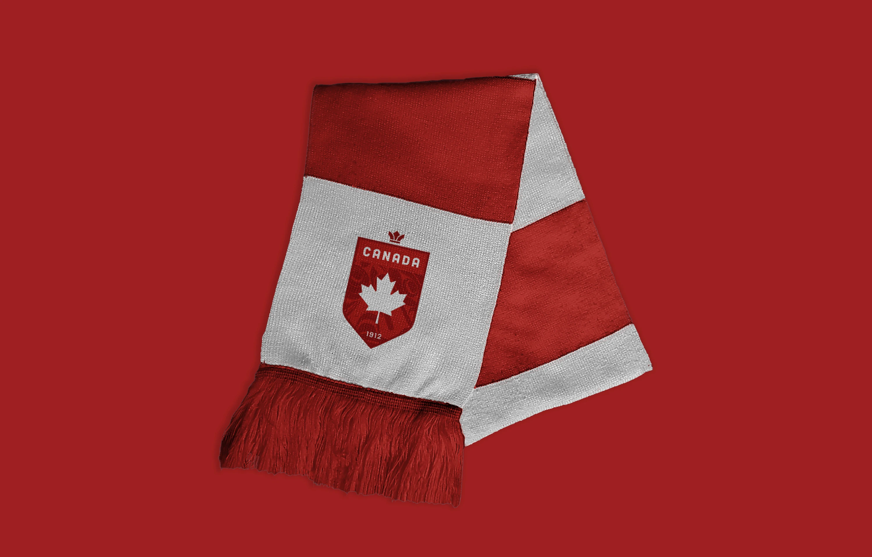
The elements in the logo include:
The Maple Leaf: Our national symbol/flag.
Indigenous Art: Canada is a place where everyone belongs. A place where we are proud of your heritage. The country has taken important steps with the Truth and Reconciliation Commission, and we believe it is important to honour the Indigenous population. The logo features a graphic inspired by Coast Salish Artist Joe Wilson’s Orca print.
Crown/Fleur de Lis: A crown motif which takes visual cues from the Fleur De Lis for it’s upper parts. A symbolism of Canada’s bilingualism.
Year of Establishment: Recognising the long history Canada has with soccer.
Typography has also been carefully selected based on two factors; 1. the type must have been created by a Canadian Type Foundry and 2. should mirror Canada’s personality. Aqueo by Vancouver based R9 Type+Design has been chosen for it’s hard straight lines illustrating our grit and determination to go further than before, and it’s soft curves reflecting a friendly and tolerant country. The secondary font is Gibson; a hard working sans created by Canada Type.

STUDEO Design: Visual Identity, Art Direction, Product Design
R9 Type+Design: Logotype
R9 Type+Design: Logotype
 PREVIOUS