Silver Valley Metals
Silver Valley Metals (SVM) is a brownfields (exploring land with historical reserves) exploration company run by Vancouver based Brandon Rook. STUDEO were approached at a time where younger investors were getting savvy with meme stocks, and more activity was appearing on community websites such as Reddit. Silver was looking to be the next commodity stock that a younger generation could get behind and with this in mind SVM wanted to rebrand in a way that visually speaks to them.
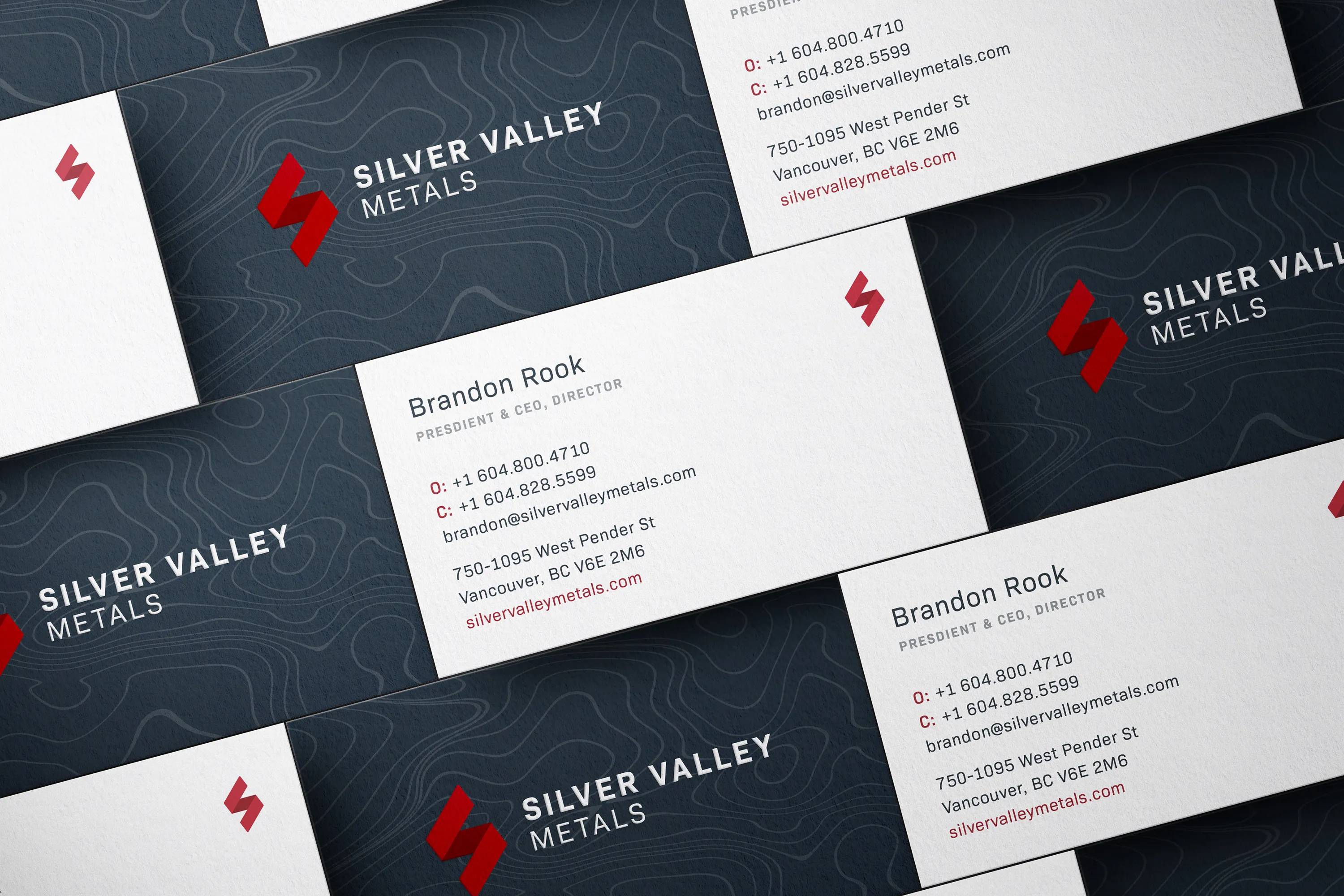
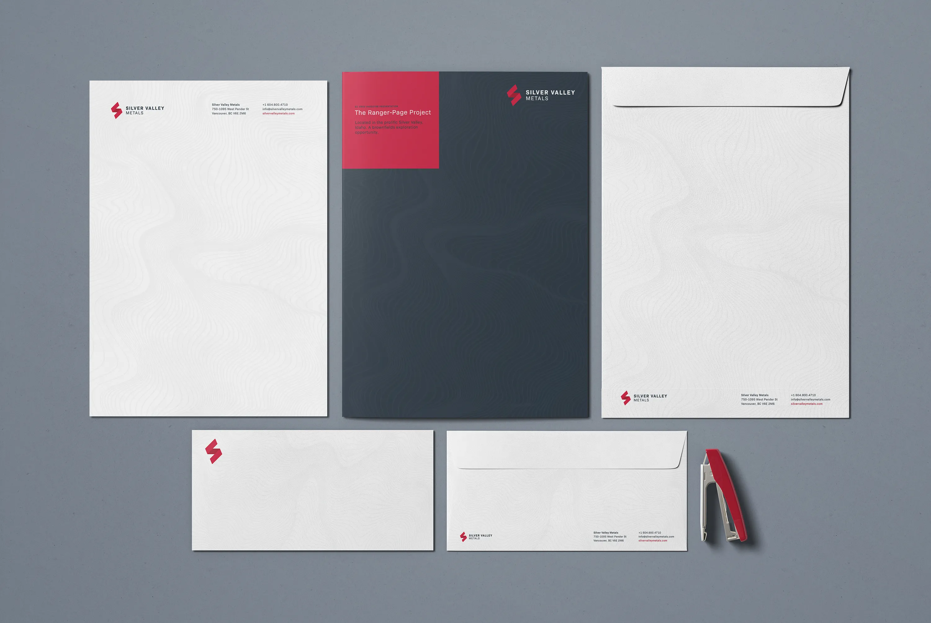
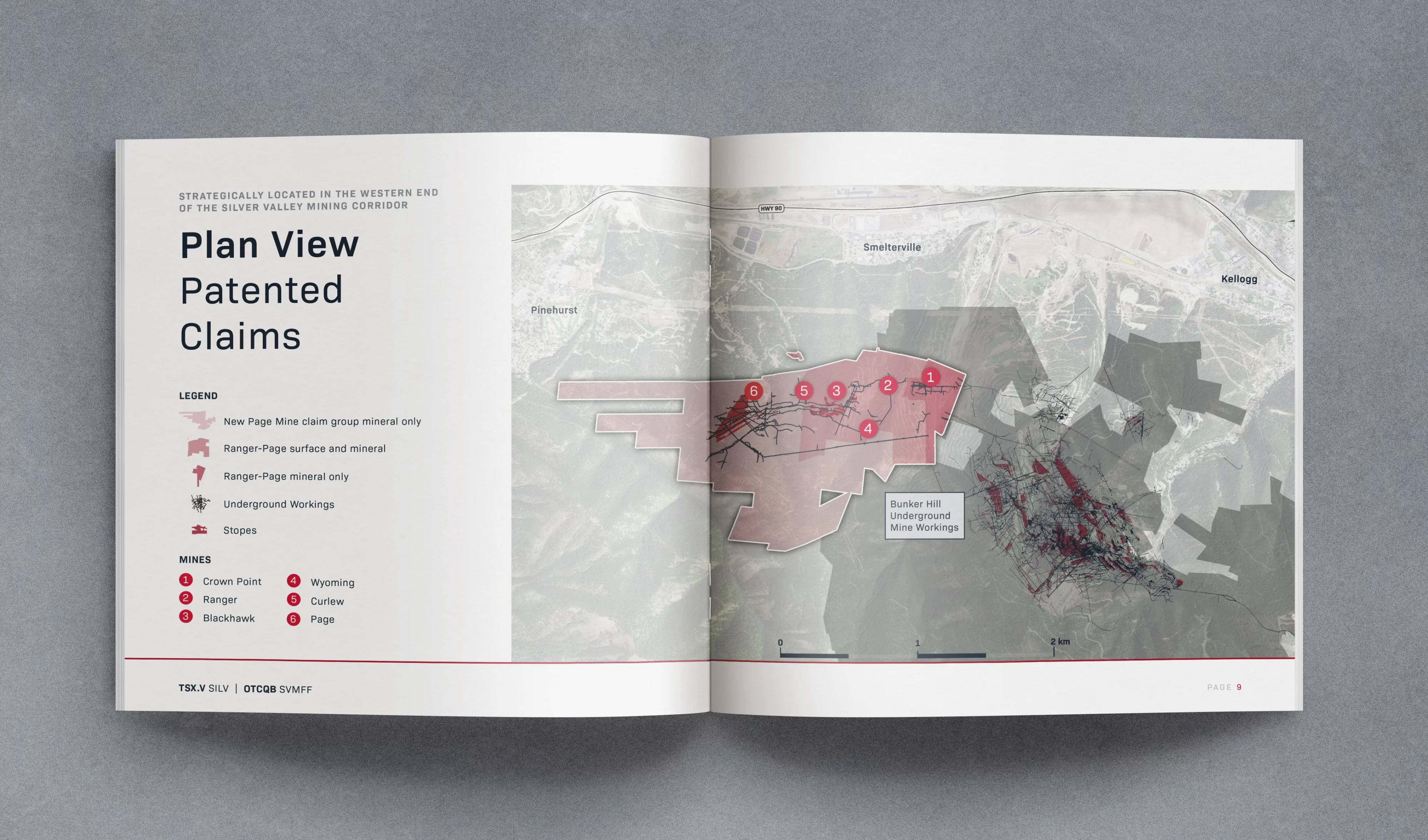
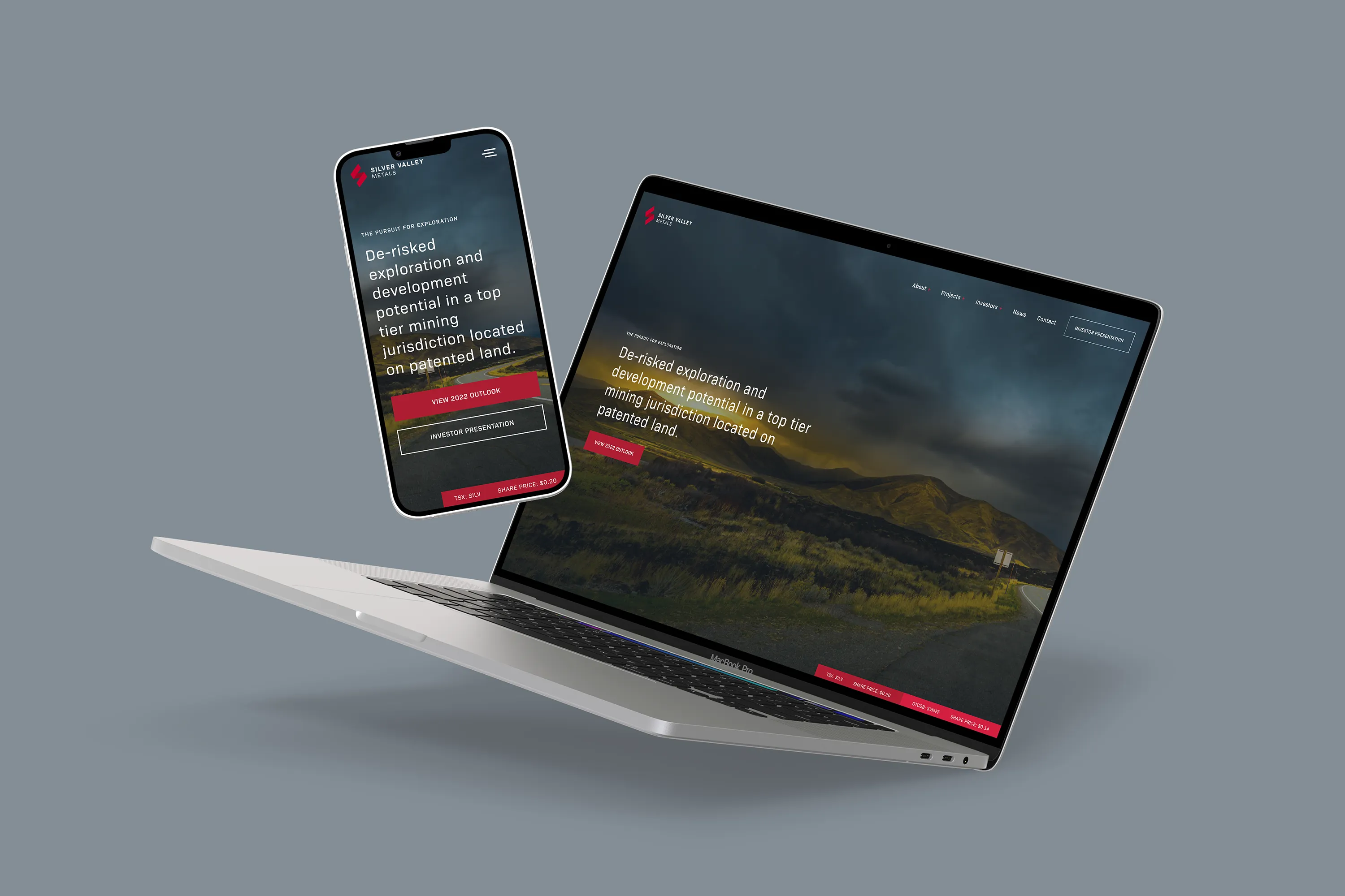
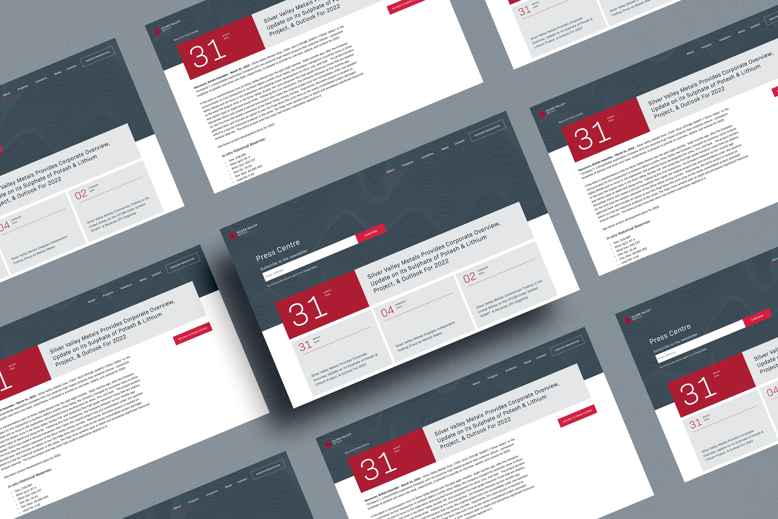
To kick things off we wanted to understand the essence of the brand by creating brand pillars and a brand story. From this process we understood SVM’s existence was a response to the global transition towards decarbonization and electrification. Silver has the highest electrical and thermal conductivity of all metals and is critical in the increase of electrical componentry required for EVs, solar panels and more. One of the brand pillars doubled as the tagline “The Pursuit For Discovery”. The existing branding was very corporate with a blue and white palette and a mountain shape reversed out of a rounded rectangle. We wanted to develop something with more energy and urgency. The resulting visual was a stylized “S” resembling the engravings on an auger used to drill into the ground. The primary logo is in shades of red, subconsciously creating the sense of urgency, while adding depth to the logo. Typography is set in Bio Sans for its industrial look whilst maintaining an approachable subtly rounded design making it easy to read in paragraphs. There was a lack of high quality imagery so there was a need for graphic devices, we opted to use topographical line patterns to create texture to be overlaid on block colour. Hero images used on the cover of reports and presentations were converted to deep black and white to let the brand colours sing. The website was stripped of low quality images and laid out in a clean informative way, using brand graphics and typography to portray information in a visually interesting way.
The rebrand was launched in time for a mining conference held in Vancouver and drew attention in an area that was congested with other mining operations.
See The Website


STUDEO Design: Visual Identity, Art Direction, Web Development
Dharma Type: Logotype
Dharma Type: Logotype
 PREVIOUS