Marq Rowhomes
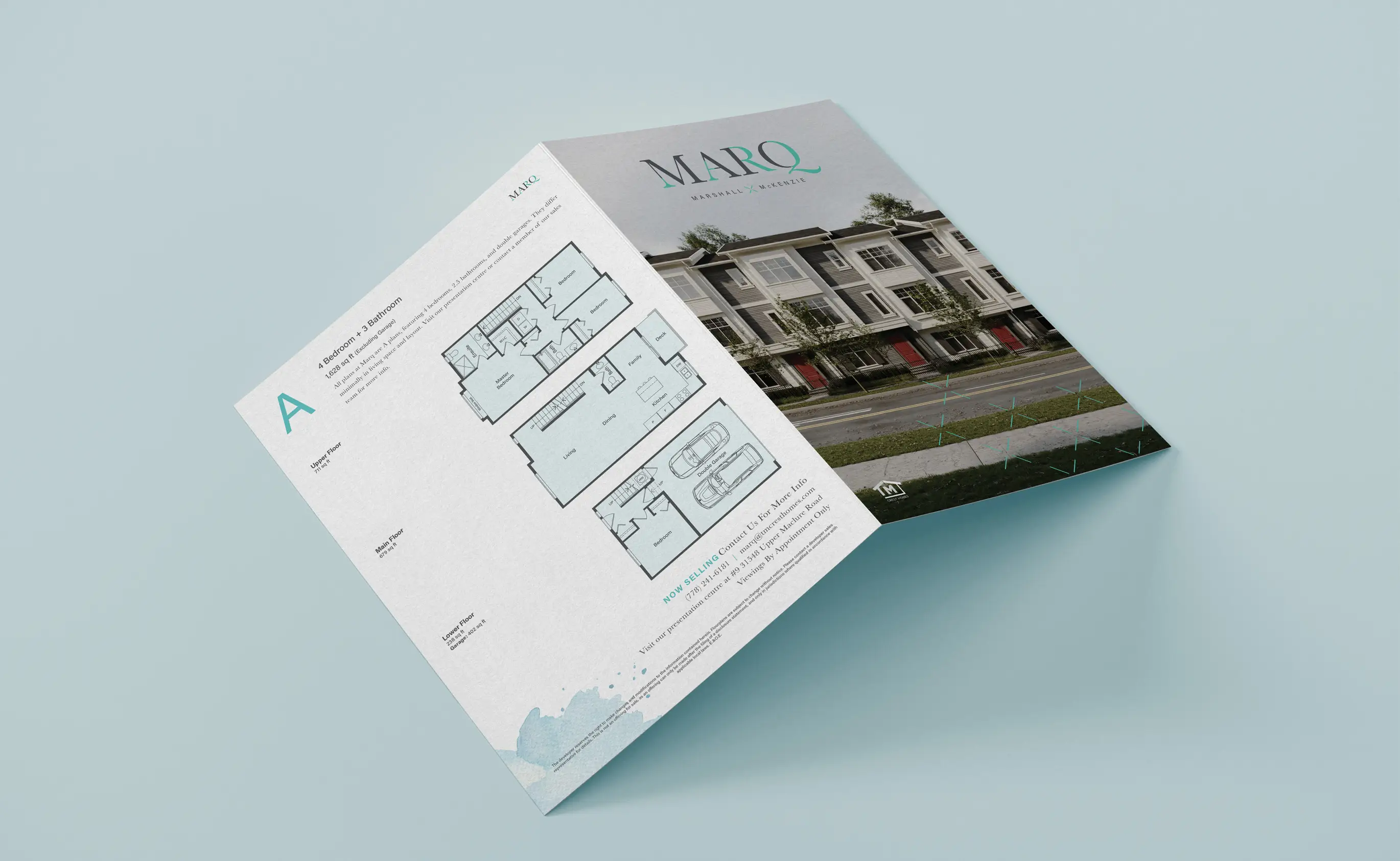
STUDEO Design worked with the executive team at T.M. Crest on naming this project. Taking the project’s location into account, Marq is a combination of the cross street it sits on. Abbotsford is a rapidly growing city so developing the brand voice was an exciting process. After thorough research, we finalized on the positioning line “Life Simplified”. We developed brand pillars and character/personality before diving into the brand story. This exercise provides a baseline to guide communications going forward, ensuring every touchpoint of the brand is consistent with the tone of voice.
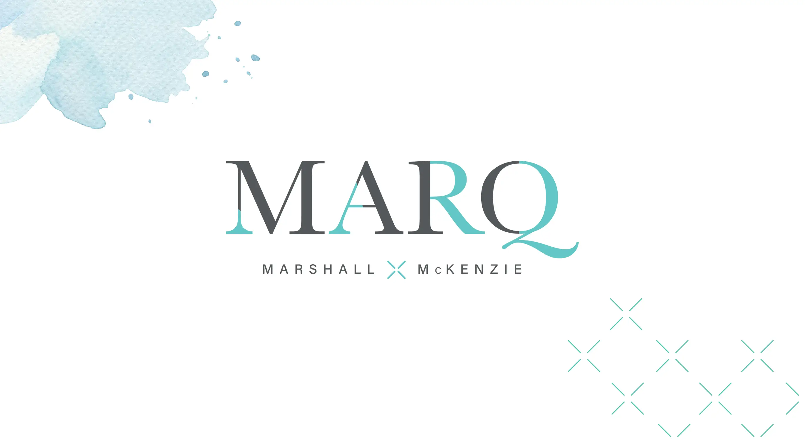
The branding is intended to echo both the established nature of the surrounding area but also point to the future. We did this by setting the word mark in elegant Baskerville type, with each letter split by colour to signify the intersection. The supporting copy was set in a modern sans; Acumin. The stencilled “X” graphic signifies the importance of the cross street and is used as a pattern throughout communications, complimented by a more traditional watercolour flourish.
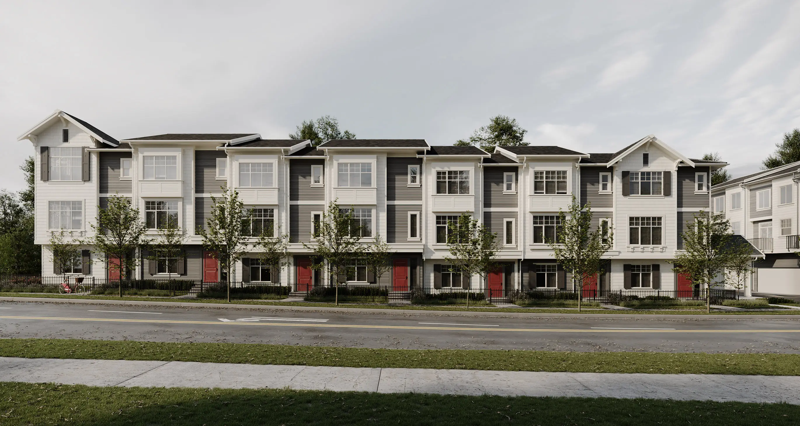
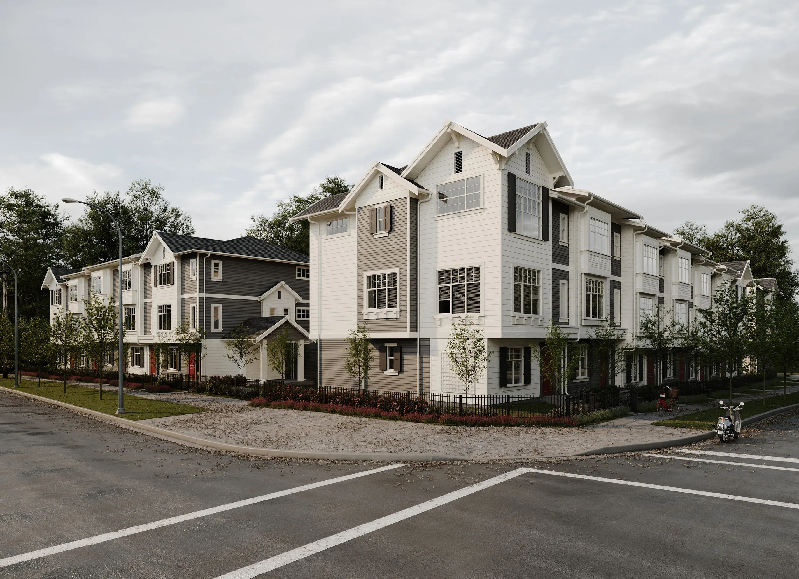
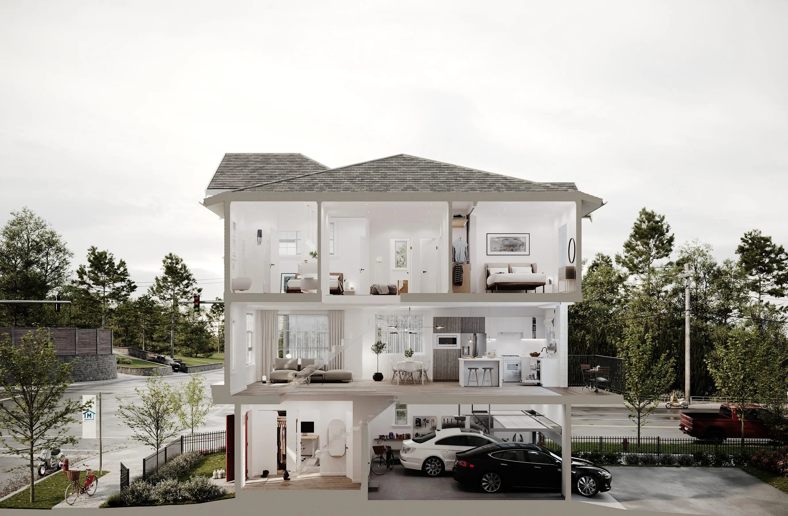
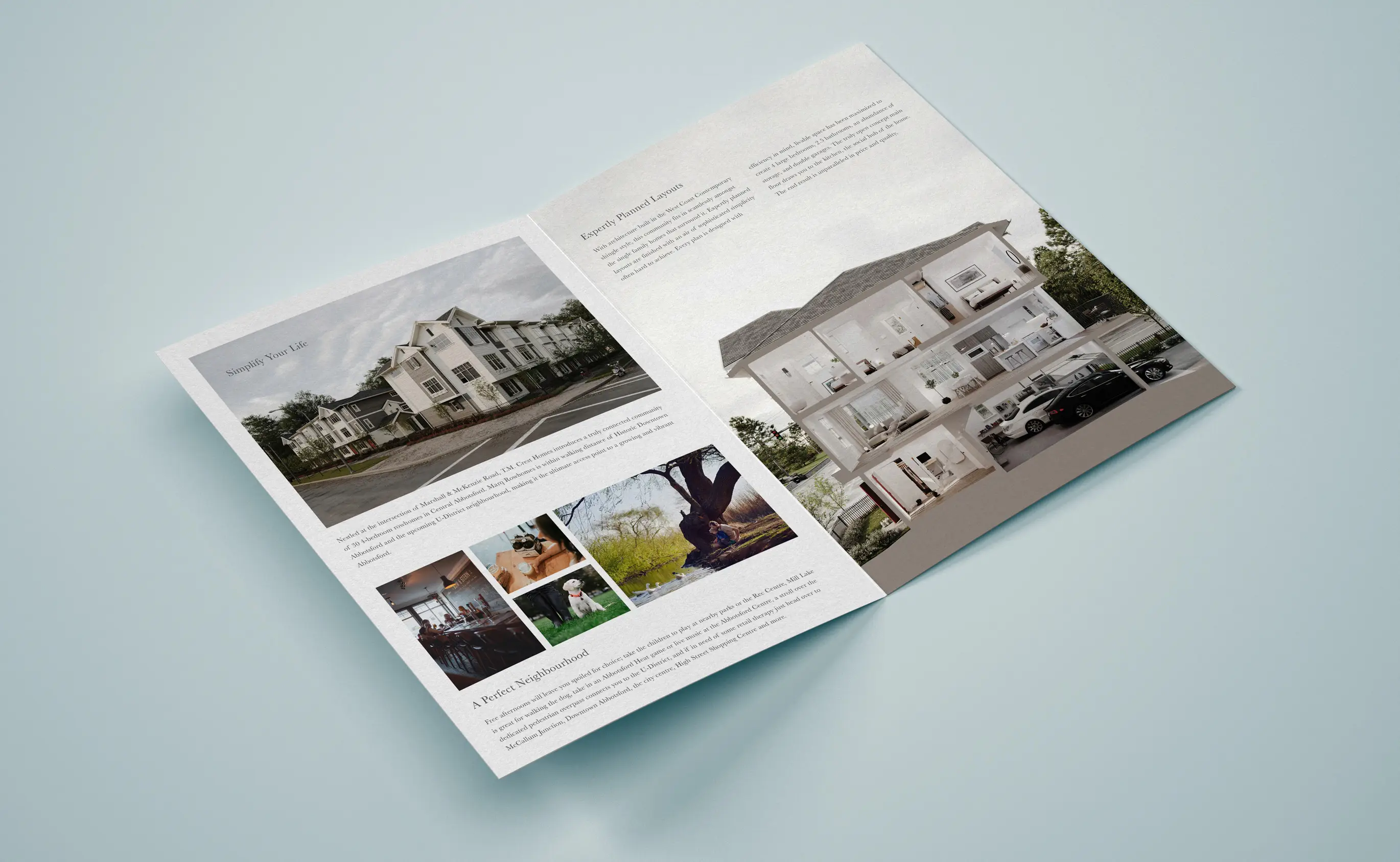
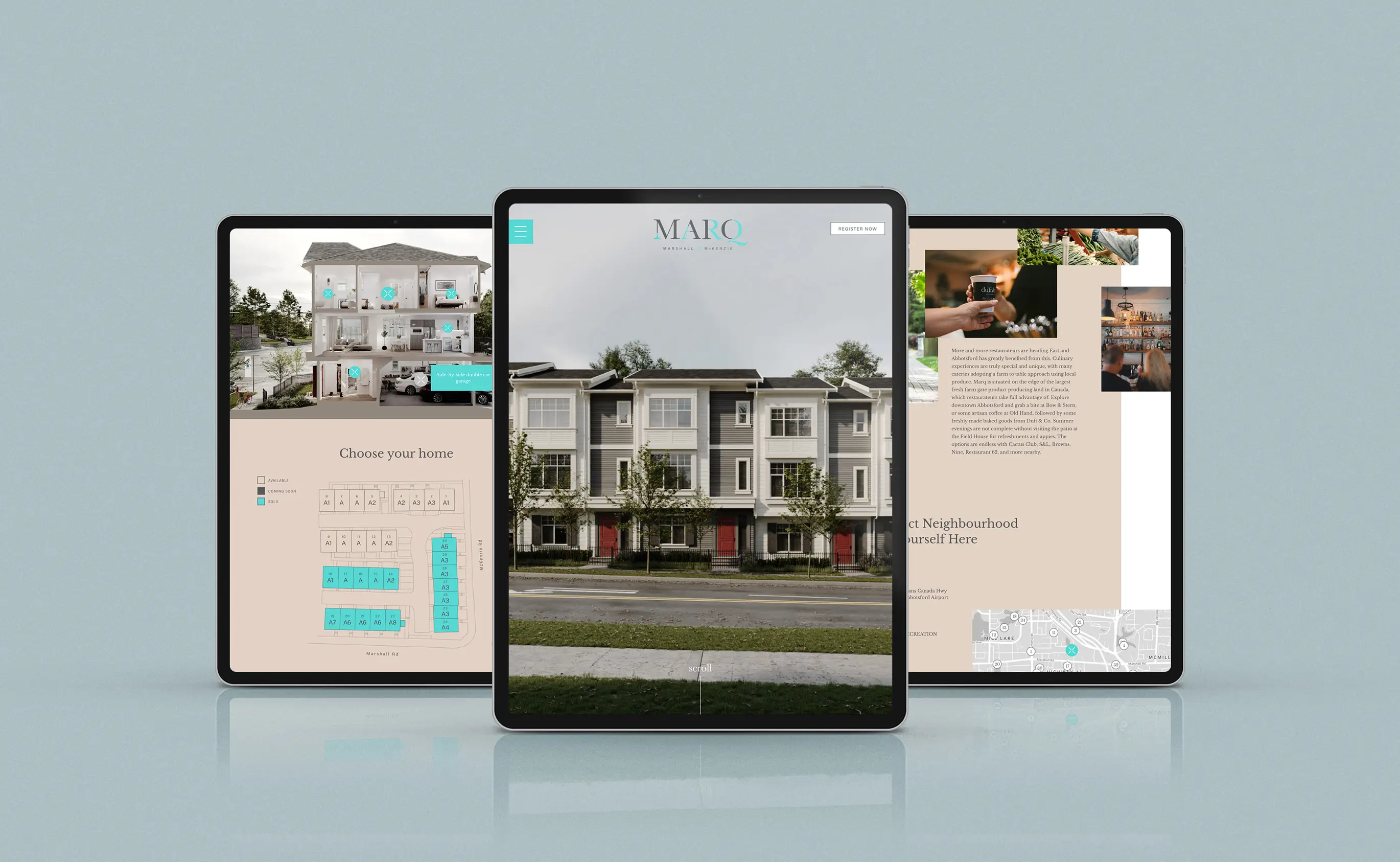
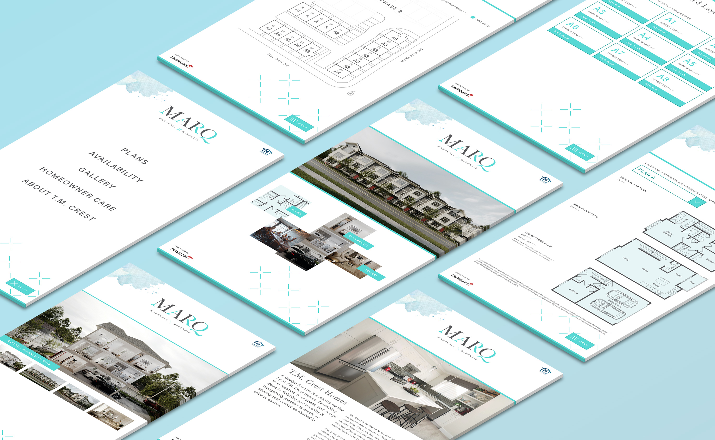
As well as branding, STUDEO Design developed the supporting materials and led campaigns throughout the lifecycle of the project. We were fortunate to work with our good friends Suburbia when art directing renderings for presale. Renderings were released VIA social and email marketing campaigns to build a subscriber list and keep them engaged throughout the buying process. The custom Marq website is built on a WordPress backbone with bespoke features including an interactive doll house view of the homes as well as an interactive sitemap to show the different plans and give administrators the flexibility to update the status of each unit (available, offer pending, and sold). We also implemented some of those unique features into a 4k touchscreen presentation put on display in the presentation centre.
Marq’s offering of location X home is incomparable in Abbotsford. Our awareness campaign rollout ensured the project was on the radar of potential buyers, leading to the project selling out shortly after the second phase was officially released.

STUDEO Design: Visual Identity, Art Direction, Web Development
Suburbia: Architectural Renderings
Linotype: Logotype
Suburbia: Architectural Renderings
Linotype: Logotype

 PREVIOUS