Brightway Accounting
Brightway Accounting is a small, family run, corporate accounting operation looking to stand out from the crowd. They have a successful business with a loyal client base, with the aims to expand with the help of a significant rebrand.
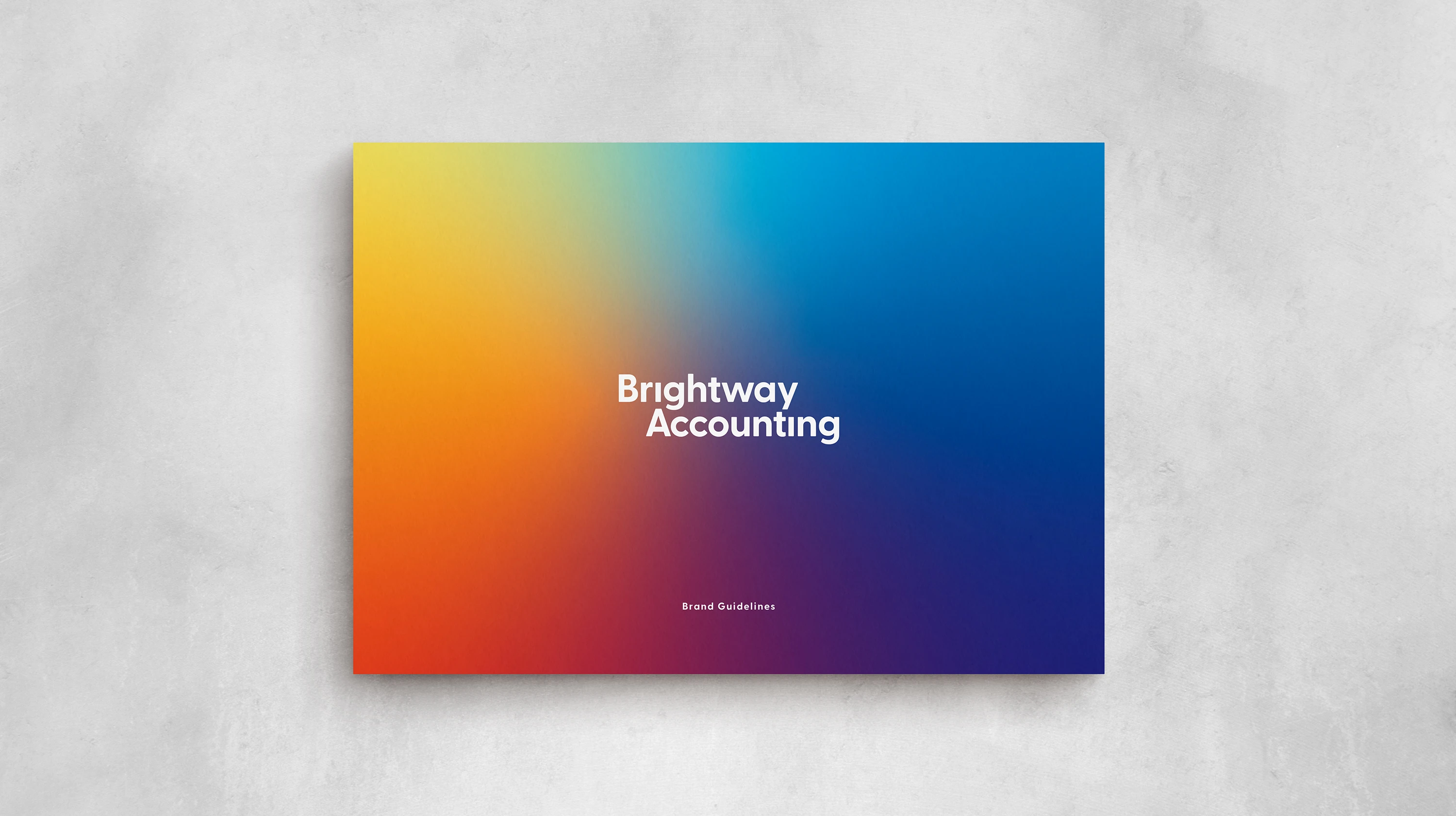
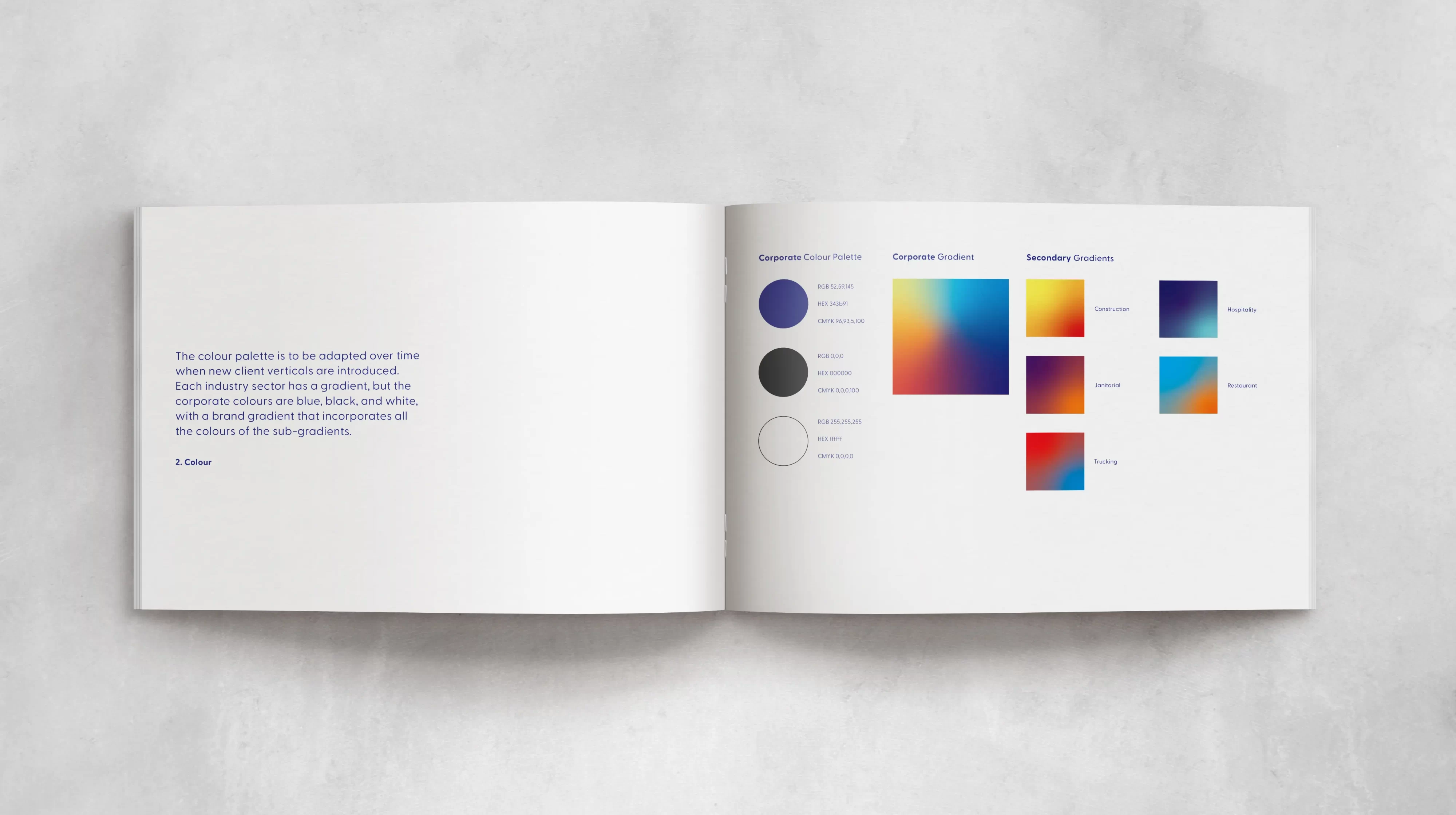
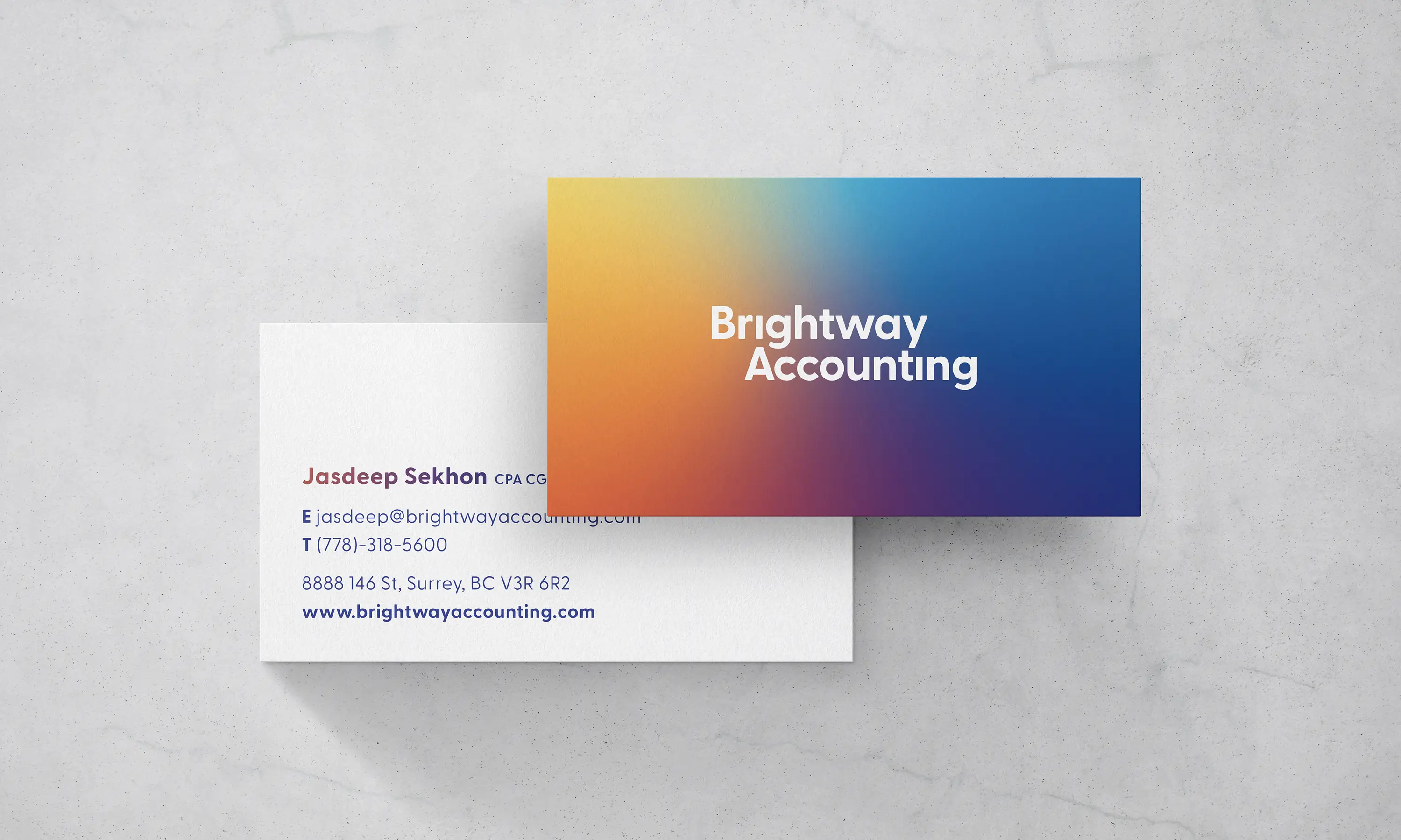
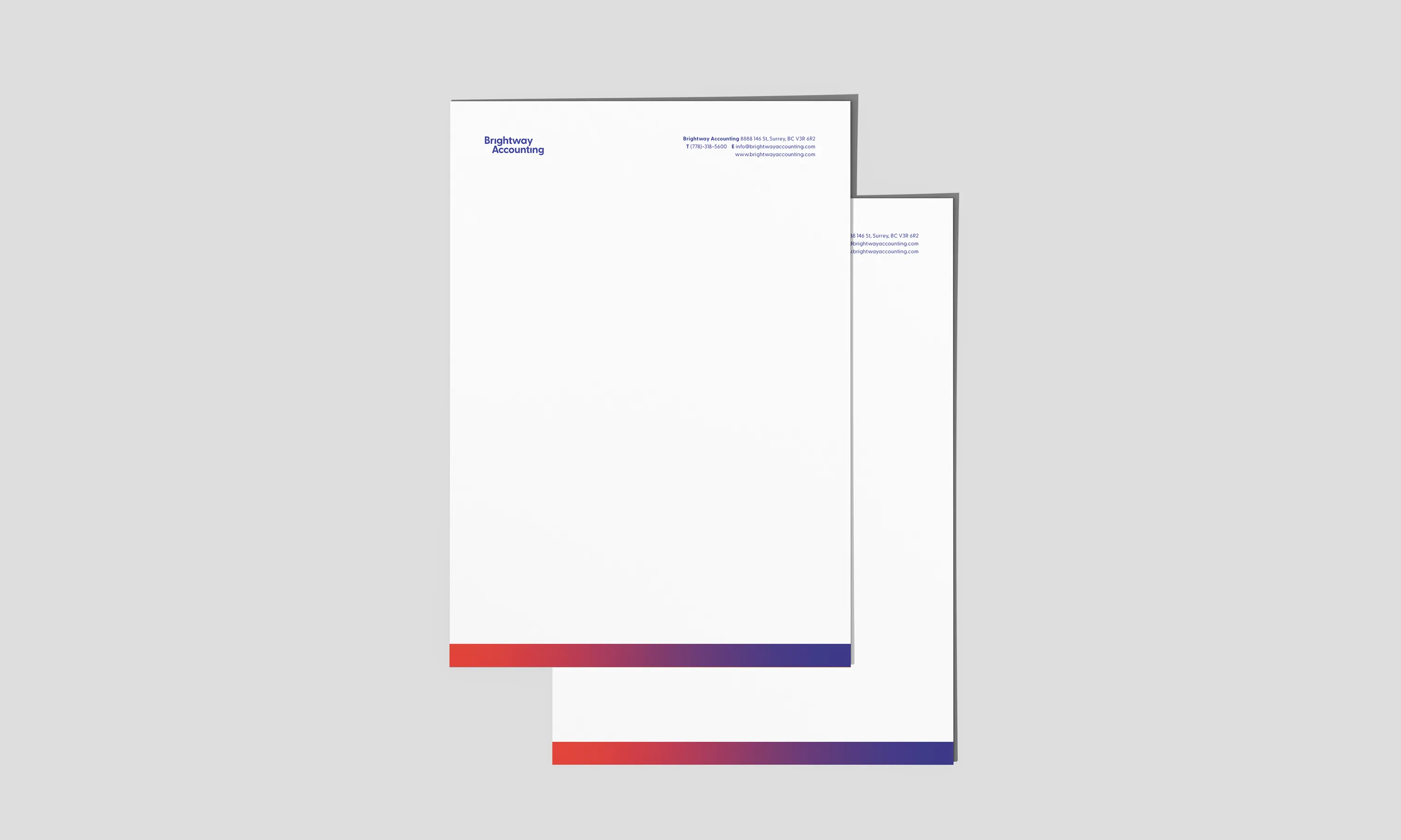
The first thing we wanted to do was to move away from the traditional blue or green that this sector is saturated with. The business name and the freedom we were given to experiment really helped to develop the gradient color system of the resulting brand. This color system allows Bightway to brand images with overlays and frames. It’s a breath of fresh air compared to competitors and gives the client a unique way to shine in this space. When they are targeting new clients there is a branded image library for the sectors they service which can be used for custom stationery such as folders, or presentations. The logotype is set in a clean, simple and approachable geometric sans, allowing the other brand elements to do the heavy lifting. A set of in depth brand guidelines were developed to help with brand implementation as Brightway continue to improve their brand touchpoints.
The end result is a playful brand system with a confident appeal and room to evolve.




STUDEO Design: Visual Identity, Art Direction, Web Design
Connary Fagen, Inc.: Logotype
Connary Fagen, Inc.: Logotype

 PREVIOUS