Atlas Auto Body
Before being renamed and rebranded, Atlas Auto Body was already a well functioning business. The new owners wanted an eye catching visual identity to help cut through the noise in this saturated market.
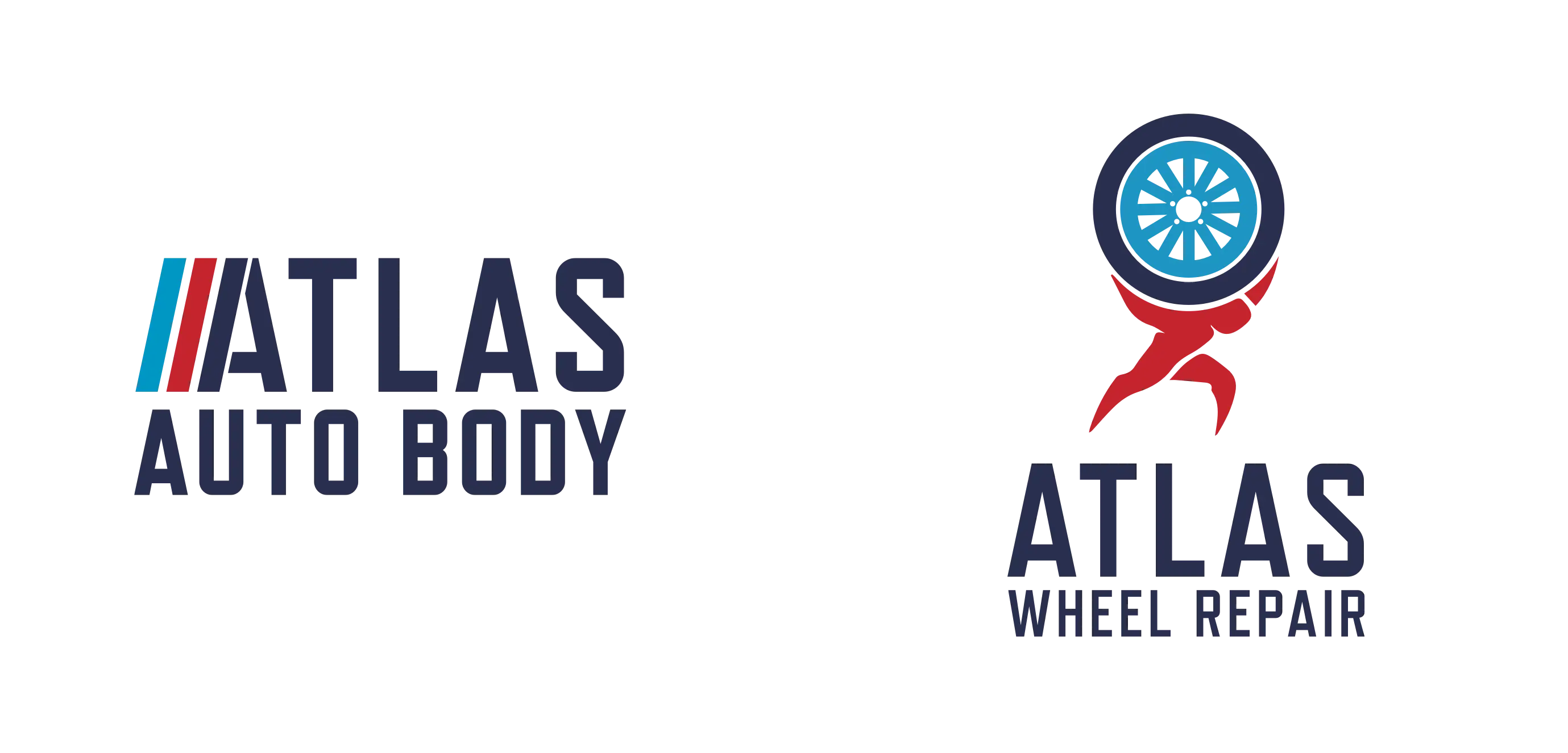
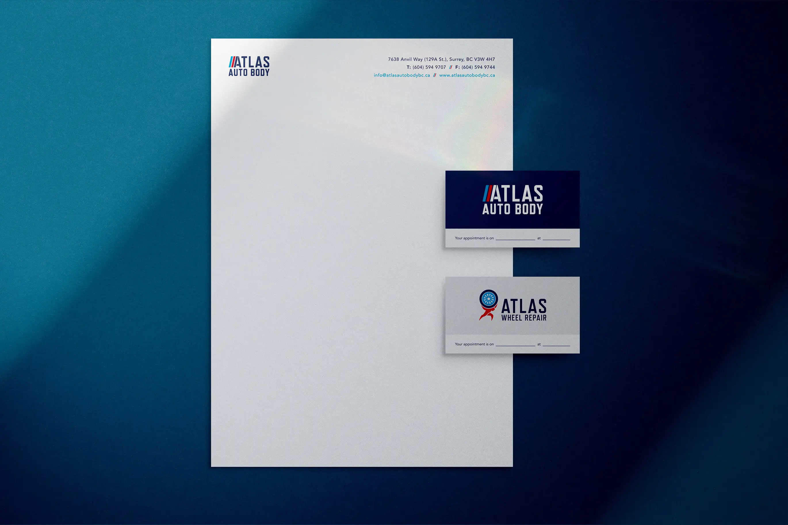
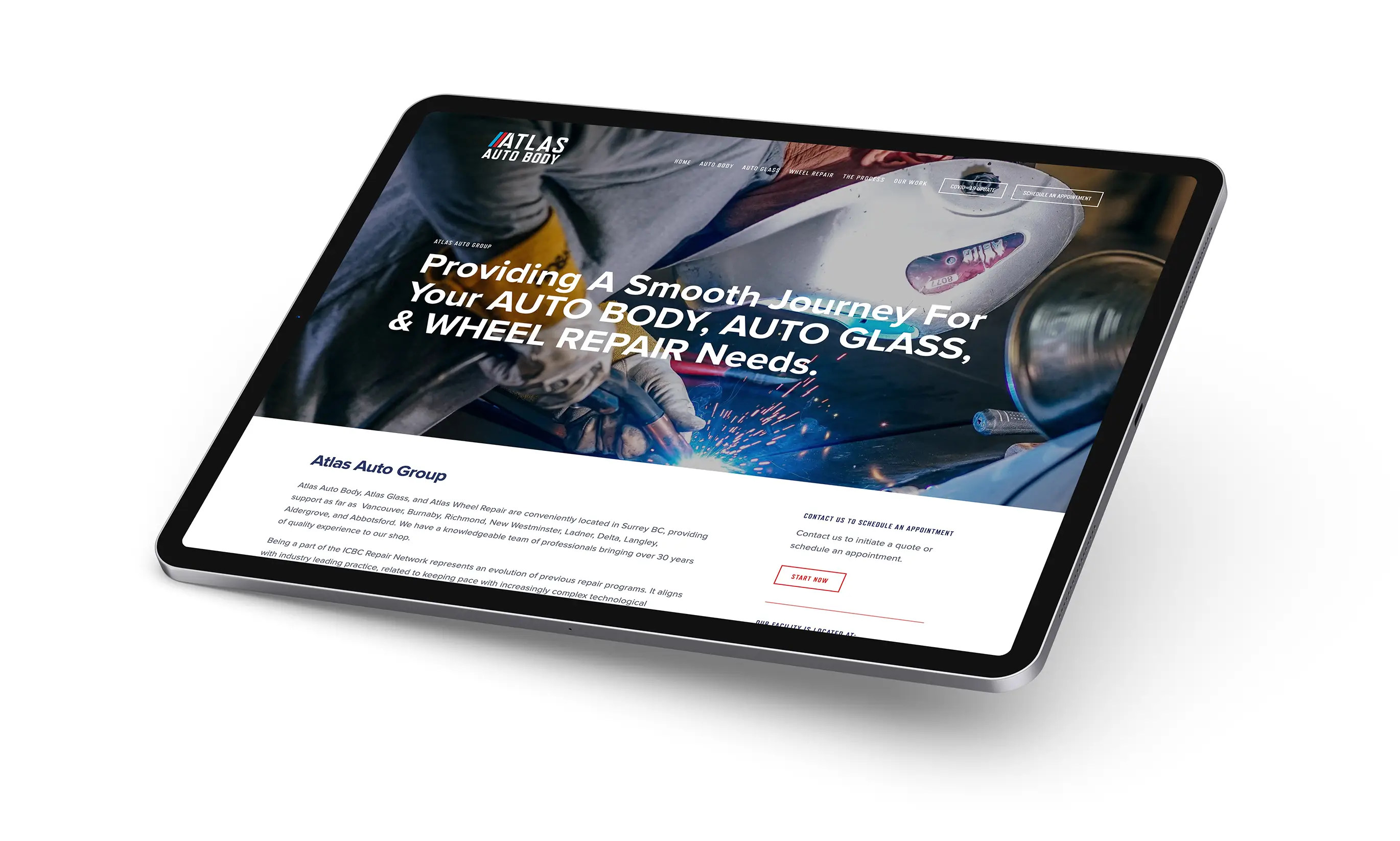
One of the insights discovered at the outset of the project was that many luxury and high performance cars came through the shop. They already garnered the trust of this clientele and this helped pave the way throughout the branding exercise. Inspired by motorsport and it’s heritage, we gravitated to the chosen performance driven logo, reminiscent of European motorsports and tuning houses. The three diagonal lines illustrate positive motion, with the final stroke intersecting the A of the wordmark. The bold angular type compliments the sporting lines observed in modern day cars. The brand palette provides plentiful energy and contrast for use across any medium. The visual identity system was applied to stationery, website, and other communications.
During the brand development process a rejected direction was resurrected as a happy accident. The company introduced a new wheel repair division which required its own unique mark. Atlas the Titan had risen from the ashes! In Greek mythology Atlas was a Titan who was condemned to hold up the heavens after trying to wage war against Zeus. Often Atlas is depicted holding up what looks like a globe. Our concept simplified Atlas holding up a tire and it was back with a vengeance.
The resulting identity resonates with the luxury and performance car clientele Atlas Auto Body boasts, but also inspires trust in the everyday customer by exhibiting an established and trustworthy appeal. The business continues to improve their output and is one of the best autobody shops in the Lower Mainland.


STUDEO Design: Visual Identity, Art Direction, Web Development
Mark Simonson Studio: Logotype
Mark Simonson Studio: Logotype

 PREVIOUS